Why Page Hierarchy Starts Before You Read
Page hierarchy shows how scale, spacing and grouping direct the eye across print, so you can trace a page’s reading order without mistaking decoration for structure.
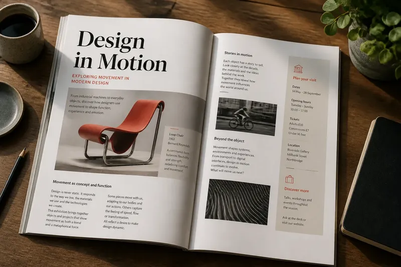
Page hierarchy is already at work before you read a word: a large heading, a tight cluster of captions or a broad blank margin gives your eye somewhere to land. To trace the order of a printed page, look first at scale, spacing and grouping, then check whether the words confirm the route those cues suggest.
This is not a hunt for the most decorative element. A coloured rule can attract attention while a quiet column of text carries the actual argument. The useful question is what the page asks you to notice next, and how consistently it makes that request.
Scale makes some information arrive first
Scale is the most obvious cue, but it includes more than type size. A photograph that occupies half a page, a title set in a heavy weight, or a small label tucked near the edge each claims a different amount of attention. The largest object usually registers early, though contrast and position can interrupt that expectation.
Compare the title with the items around it. Does it dominate the page, or does a bold subheading compete with it? If the title and a promotional badge share similar weight, the reader may not know which one is meant to introduce the page. That does not make the design unusable, but it makes the order less deliberate.
Scale also signals relationships. A heading set larger than body text usually announces a new section; a smaller, lighter line directly beneath it may clarify the heading rather than start a separate subject. When sizes shift without a clear pattern, the reader has to infer whether the change marks importance, a new topic or merely a stylistic preference.
Try squinting at the page or viewing it from a little farther away. The words become harder to read, but the large shapes remain visible. Notice which element appears first and which groups seem to belong together. This quick glance is not a substitute for reading; it is a way to see the page’s broad order without being pulled into the copy.
Spacing shows which elements belong together
Spacing is not empty territory. A narrow gap between a heading and its paragraph suggests a connection; a larger gap before the next heading signals a change. The same principle applies between an image and its caption, or between a list and the paragraph that follows it.
Look at the spaces between items, not just at the items themselves. If the gap between a caption and its image is larger than the gap between that caption and the next paragraph, the caption may seem attached to the paragraph instead. The words cannot repair a grouping that the layout has quietly reassigned.
Margins and columns add another layer. A page with one broad text column may offer a straightforward top-to-bottom route. A page with a main column and a narrow side note area asks the reader to distinguish the central sequence from supporting material. Alignment can help: elements sharing a left edge often appear related, though a consistent grid matters more than any single alignment.
Blank space can also separate competing tasks. A page may invite a reader to browse a feature, inspect a caption and then consult a sidebar. If those zones are packed together, their intended order becomes less apparent. If they are separated too sharply, the sidebar may look like an unrelated insert.
Grouping can clarify or confuse the route
Grouping is the combined effect of proximity, alignment, scale and visual treatment. A heading, short introduction and image can read as one unit if they sit close together and share a consistent edge. A line, tinted panel or change in type may reinforce the group, but the relationship should still make sense without the extra decoration.
One useful way to inspect a page is to trace its likely route with a finger or pencil, without reading every sentence. Start at the element that draws attention first, then move to the closest related item. Continue through the page and note where you hesitate, double back or skip a zone. Those pauses often point to a weak transition or an unclear relationship.
Imagine a museum leaflet with a large exhibition title at the top, a photograph beneath it, a short caption beside the photograph and practical visitor details in a narrow panel. If the title and photograph align while the caption sits close to the image, the opening sequence is likely to read as title, image, caption. If the visitor panel shares the same heading style and crowds the photograph, a reader may switch to practical details before understanding what the leaflet is about. Moving the panel farther from the feature and giving it a quieter heading would be expected to make the two groups easier to distinguish.
That imagined change is not a universal recipe. A leaflet designed for visitors who need opening information immediately might rightly give those details more prominence. Hierarchy is not a fixed ladder of importance; it is an arrangement that makes the intended task legible.
Three ways to trace a printed page
Different inspection methods reveal different parts of the hierarchy. Choose according to what you need to understand: the broad visual route, the page’s grouping, or the way a particular reader may approach it.
What does a quick glance reveal?
A quick glance shows the page’s first signals: large type, strong contrast, prominent images and isolated blocks. It suits someone checking whether the main subject is apparent before close reading. It cannot tell you whether the body copy is clear or whether a subtle caption is correctly attached.
What does a slow, element-by-element trace reveal?
Following each heading, paragraph, image and caption in turn exposes the relationships between them. This suits designers refining a feature page or editors checking that the layout follows the content’s logic. It is slower than a glance, but it can reveal a sidebar that interrupts the main sequence or a heading that appears to introduce the wrong paragraph.
What does reading for a specific task reveal?
Choose a real purpose, such as finding a date, comparing two items or locating a credit, and follow the route needed to complete it. This suits pages with more than one audience task, including programmes, catalogues and information leaflets. It shows whether the hierarchy helps a reader find that detail without mistaking a supporting element for the main subject.
Choose the inspection method that matches the page
Use the quick-glance approach when the main concern is first impression: does the page announce its subject, and does one element overwhelm everything else? Use the close trace when the concern is editorial sequence: do headings lead into the right sections, and do captions remain attached to their images? Use task-based reading when the page must serve a practical purpose as well as present material.
These approaches can be combined, but they answer different questions. A glance can make a page look orderly while a task-based read exposes an inconveniently placed reference. A close trace can confirm the sequence of a feature without revealing that a first-time reader might mistake a decorative panel for the main story.
For a useful review, mark the route on a printout with a pencil. Draw a small arrow from each element to the next, then circle any place where the next move is uncertain. Avoid marking every flourish. The point is to record the transitions that carry information, not to produce a map of every visual detail.
Decoration should support the order, not impersonate it
Colour, rules, borders and ornamental type can help separate sections or draw attention to a detail. They become less helpful when they imply a relationship that spacing contradicts. A coloured box may look like the page’s main message even when it contains a secondary note; a fine line may divide two items that belong together.
Temporarily ignore the decoration and inspect the underlying arrangement. Look at the size and weight of type, the distance between blocks, their alignment and their position on the page. Then bring the decorative elements back into view and ask whether they reinforce those relationships or compete with them.
Removing colour mentally is not a demand for colourless design. It is a way to tell whether the structure depends entirely on a visual accent. If the page’s order disappears as soon as a coloured panel is overlooked, the underlying hierarchy may need clearer spacing or more distinct type levels.
Small page cues answer common questions?
Does the largest item always come first?
No. A highly contrasting label, an image or an isolated block can attract the eye before a larger heading. Check the page at a glance, then compare what drew attention with the sequence the content is meant to establish.
Can whitespace be part of the hierarchy?
Yes. Gaps distinguish sections, attach captions to images and set side material apart from a main column. Their meaning depends on consistency: similar relationships should generally receive similar spacing.
How can I tell whether a caption belongs to an image?
Check distance and alignment first, then see whether nearby captions or text blocks compete for the same connection. If the association remains unclear, a clearer position or a more direct visual link may help.
Should a printed page have one reading order?
Not always. A feature may have a main sequence alongside a sidebar or reference panel, and some readers will begin with the detail they need. The layout should make the main route clear without making supporting routes look accidental.
Read the structure before judging the style
When a page feels confusing, trace its hierarchy before deciding that it needs more colour, larger headings or another decorative device. Identify the first element, follow the spaces and alignments, and see whether each group leads naturally to the next. Often the useful change is not an added accent but a clearer gap, a better-positioned caption or a quieter secondary heading.
Page hierarchy becomes easier to judge when you can describe the route in plain language: title, image, caption, body, reference note. If that description is hard to produce, the page may be asking its visual cues to do too many things at once. A pencil, a printout and a brief pause before reading are enough to begin tracing where the eye is being sent.